My illustrations are shaped by nature, evocative lighting, and whimsical surrealist elements. To articulate this clearly, I needed to pause, step back, and honestly look at both the work I’ve made and the work I want to pursue. That reflection is what sparked this re-branding project.
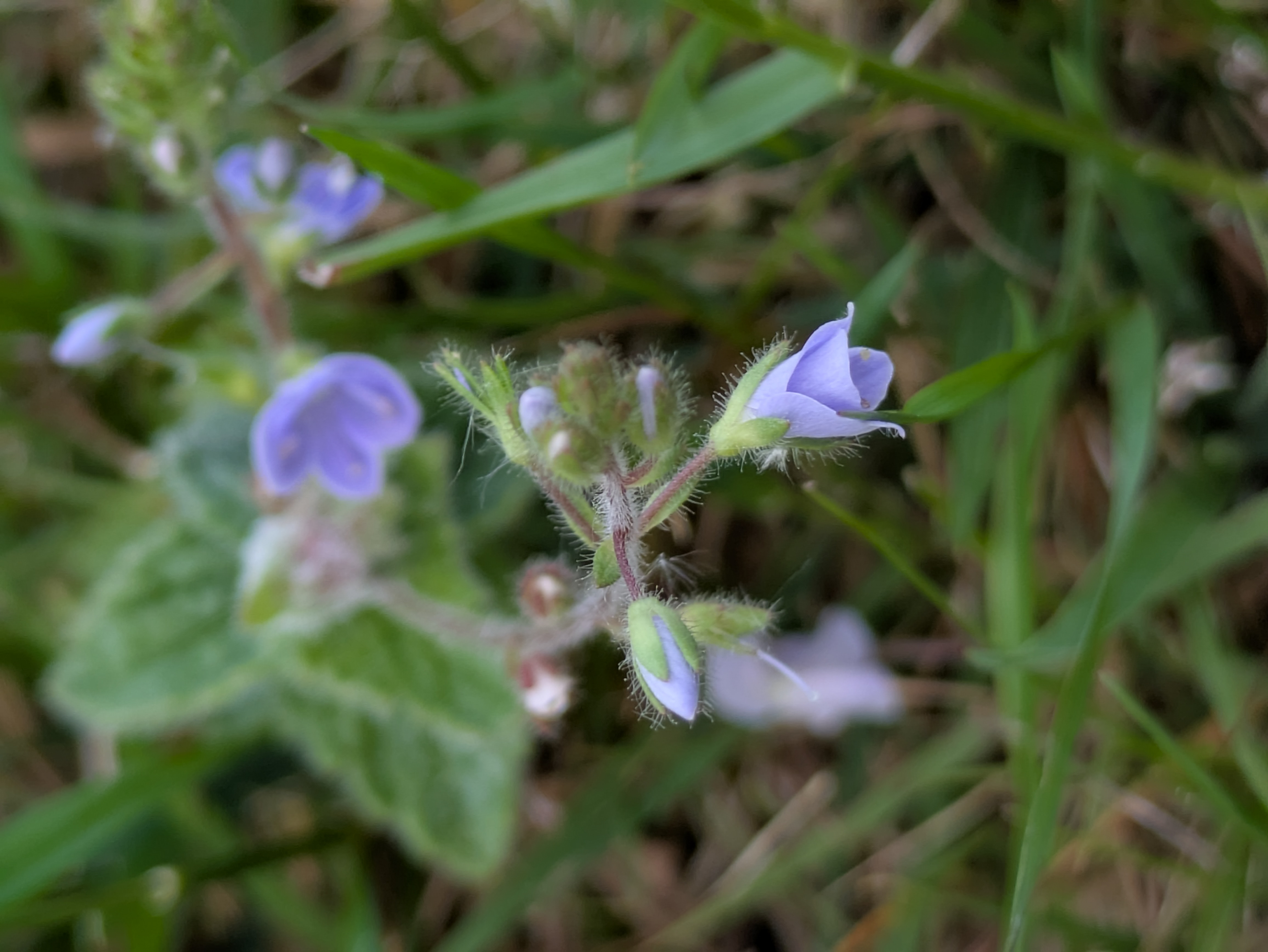
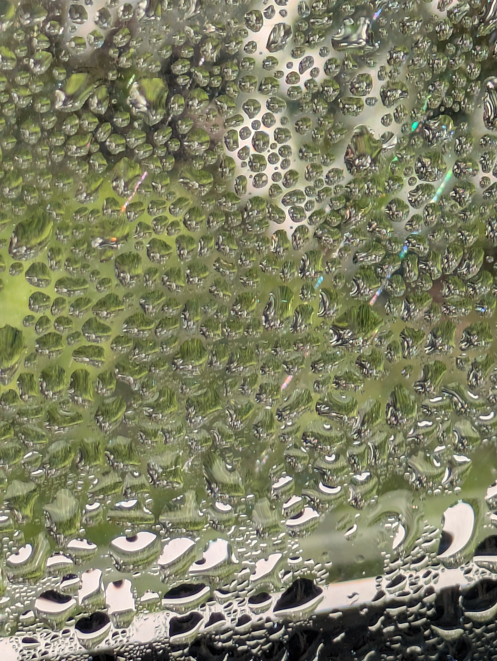
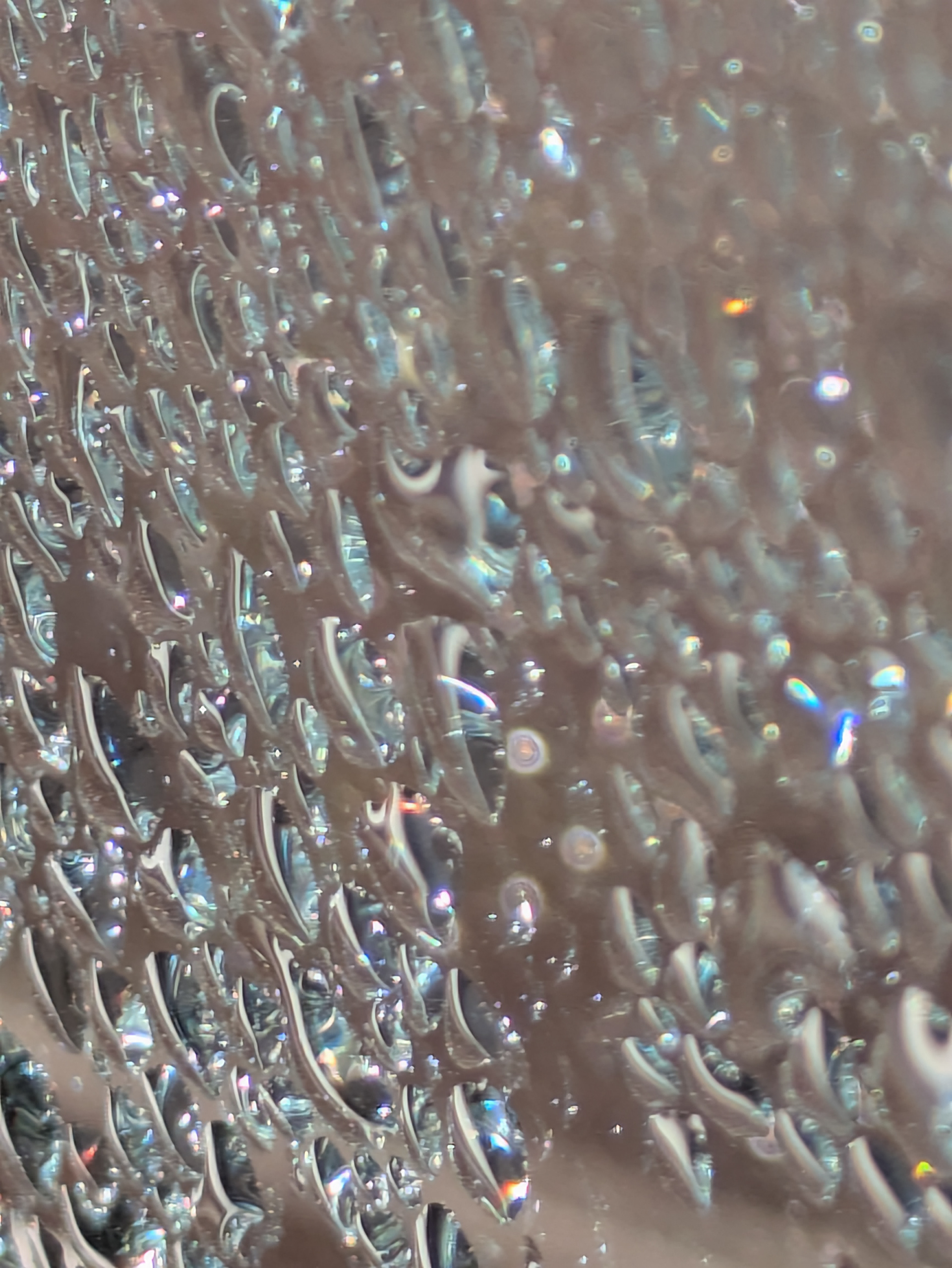
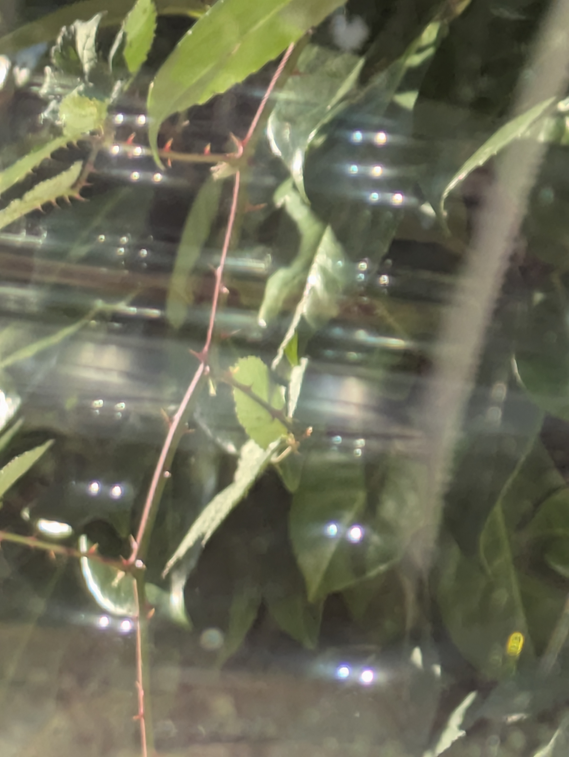
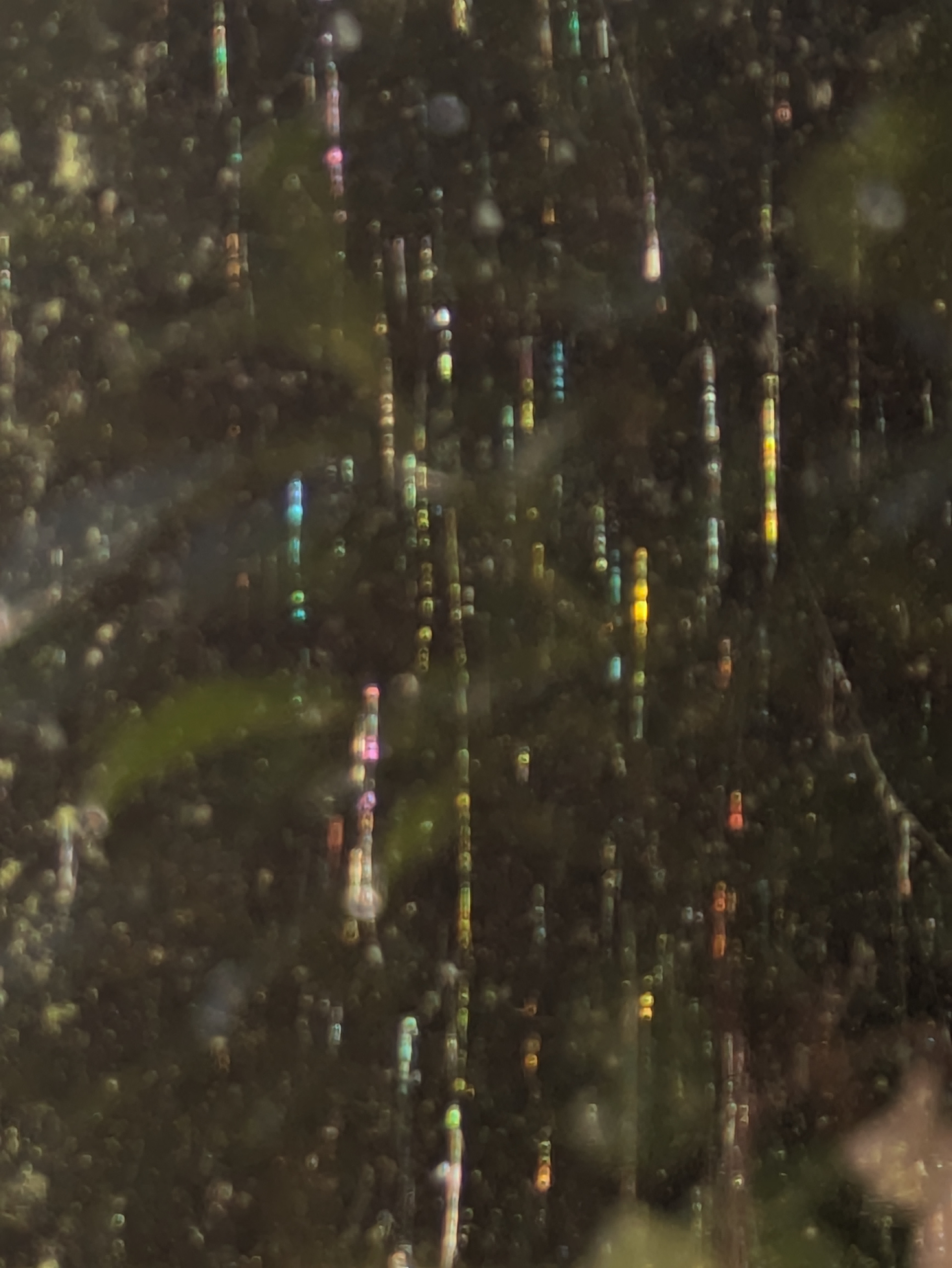
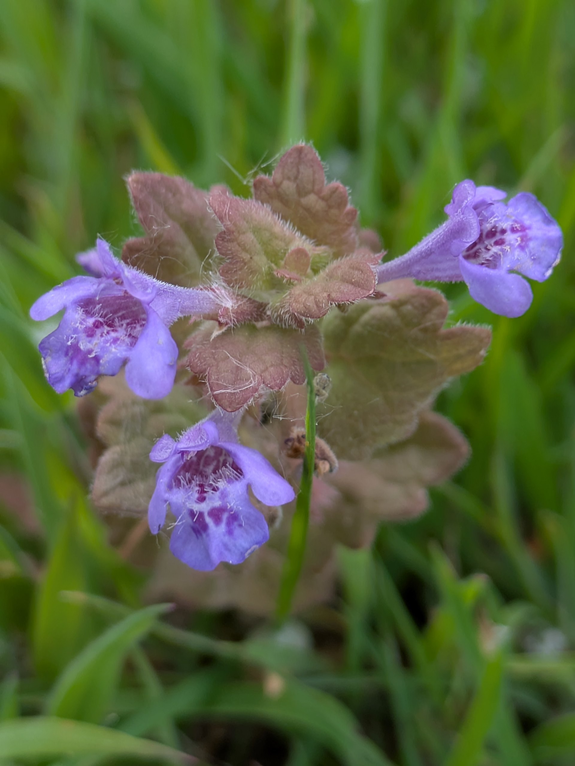
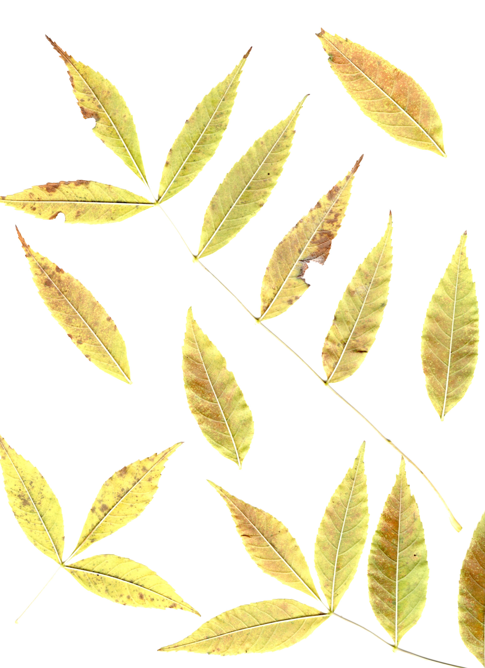
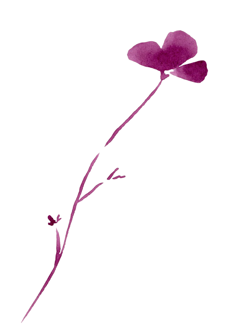
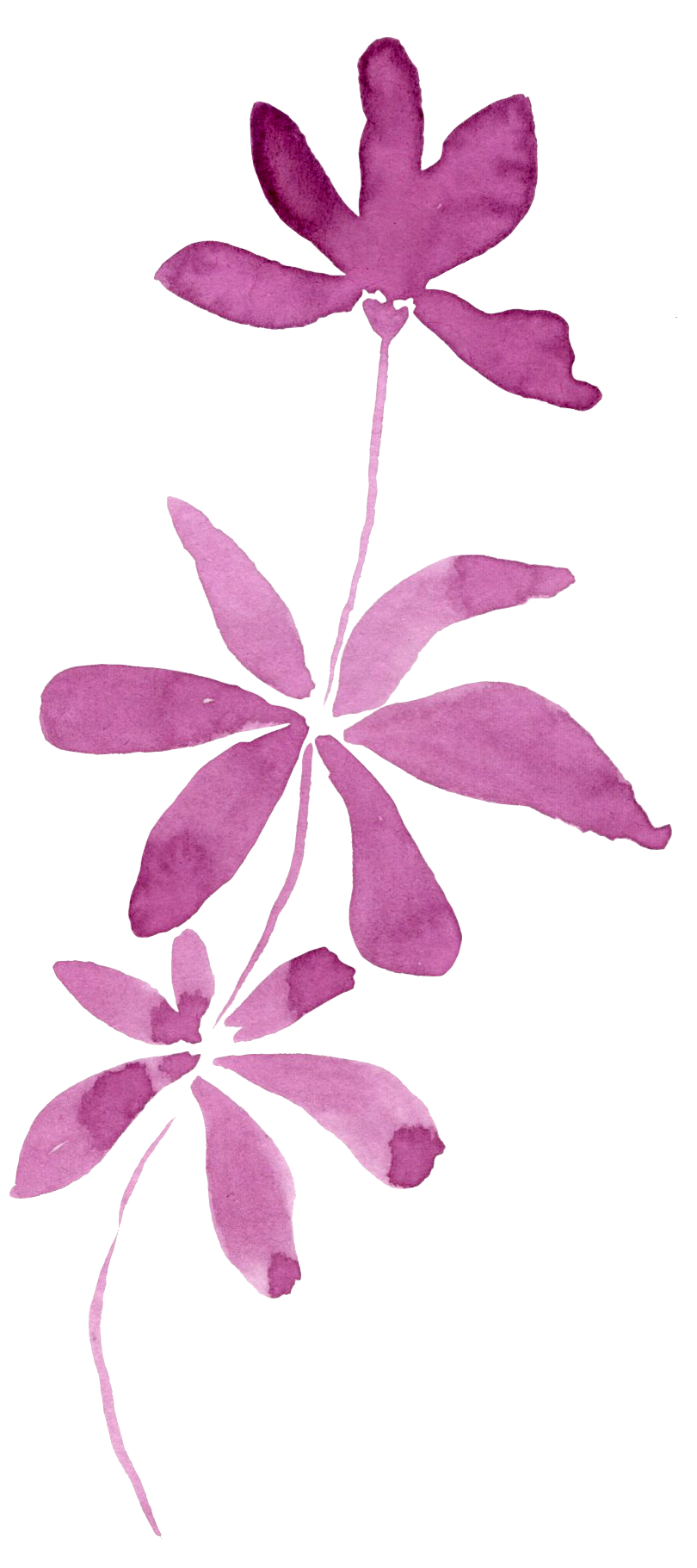
To begin this project, I gathered a selection of my own photographs that captured the atmosphere I wanted to express. From there, I set out to collect additional reference images and textures especially those that conveyed the striking lighting compositions I felt were missing. This process naturally evolved from simple floral studies into crystal-like raindrops, sharp vibrant spiderwebs, and dreamy, glowing light reflections.
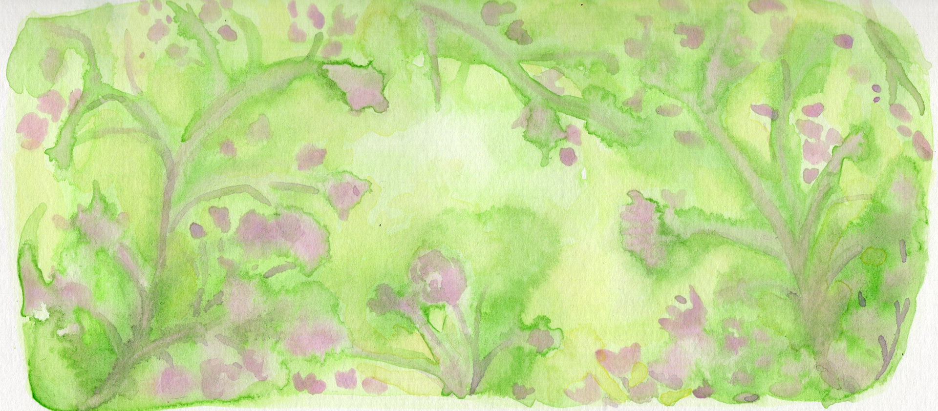
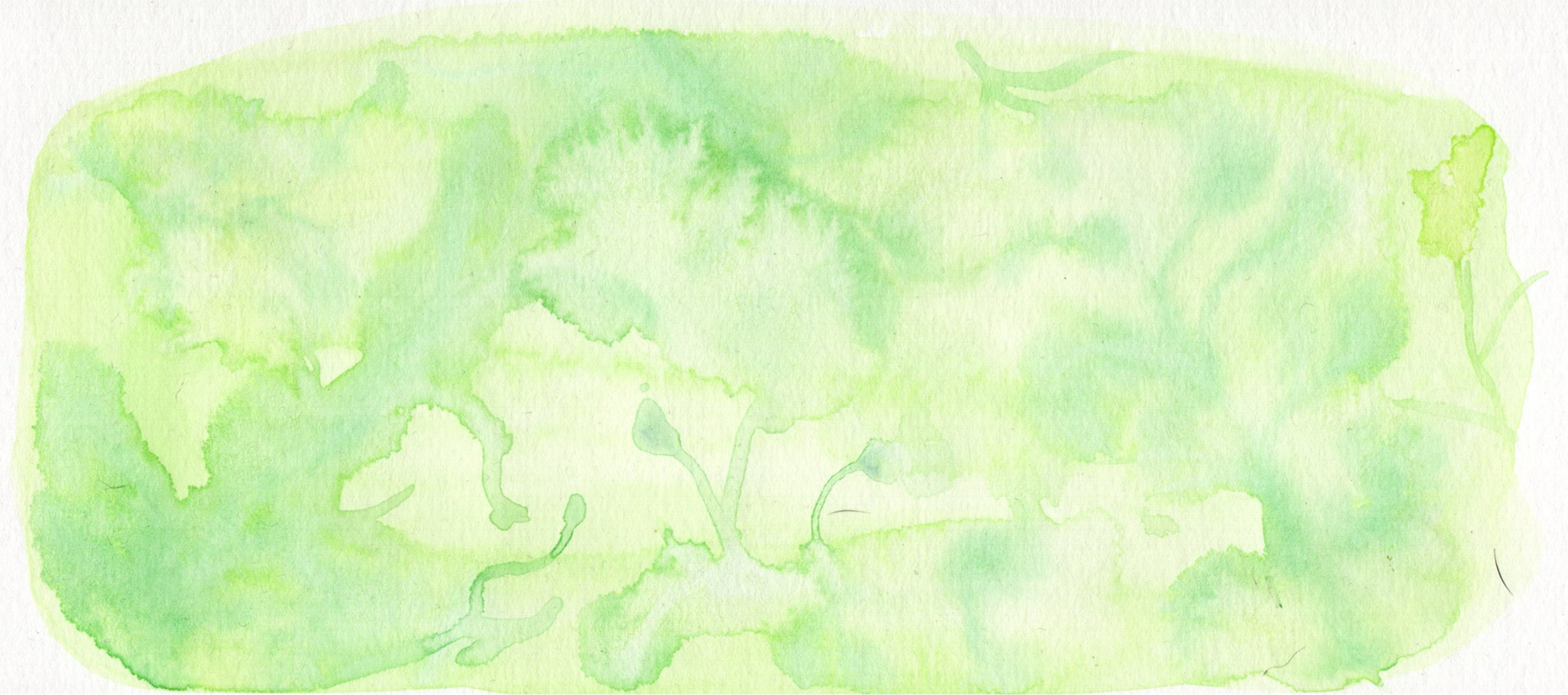
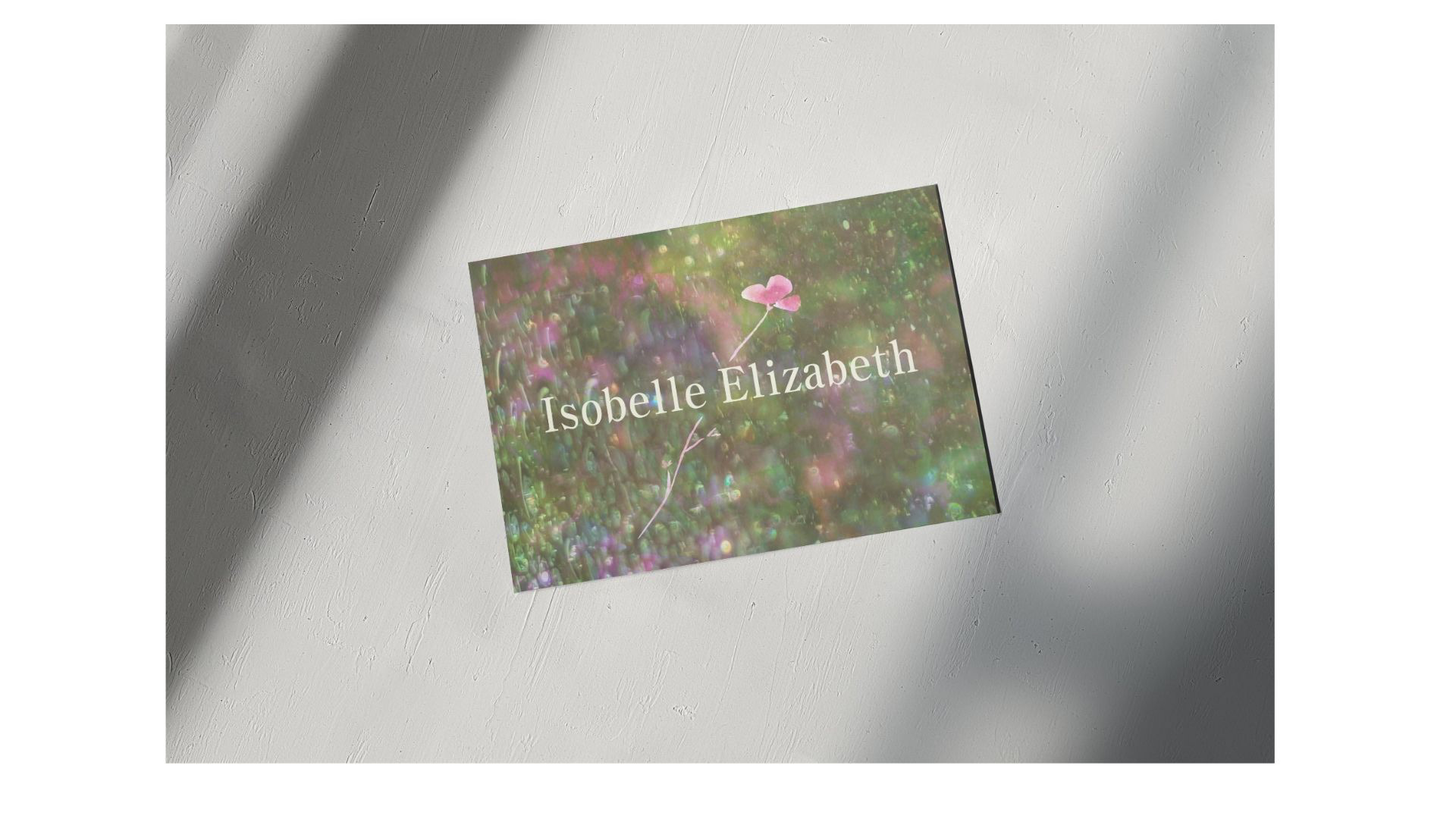
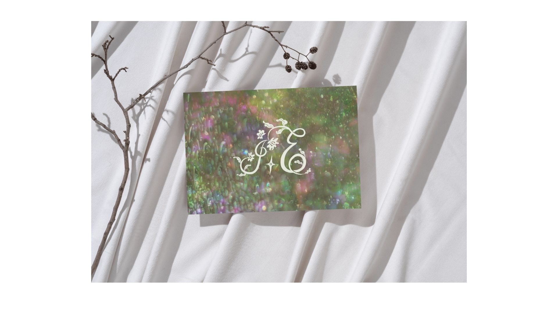
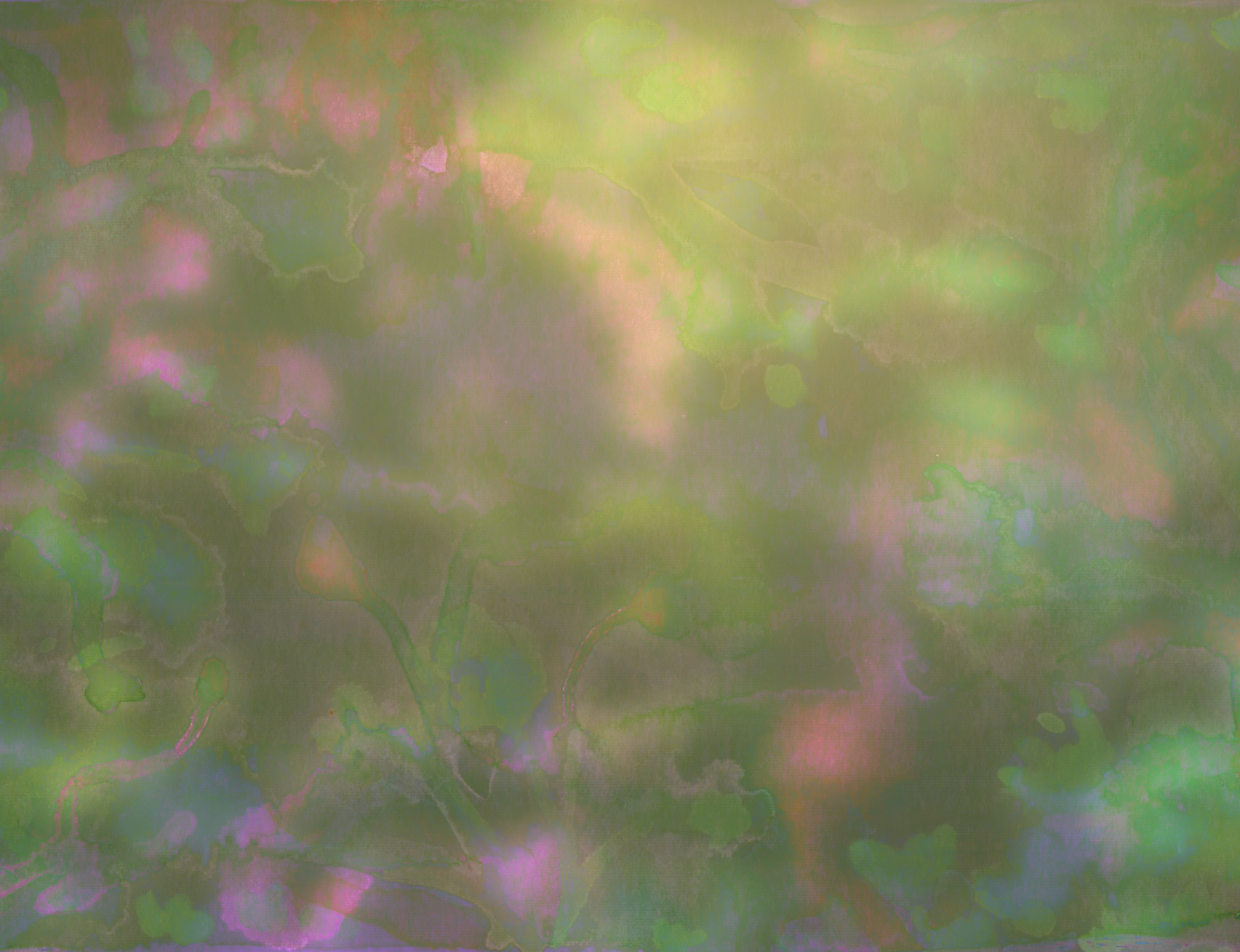
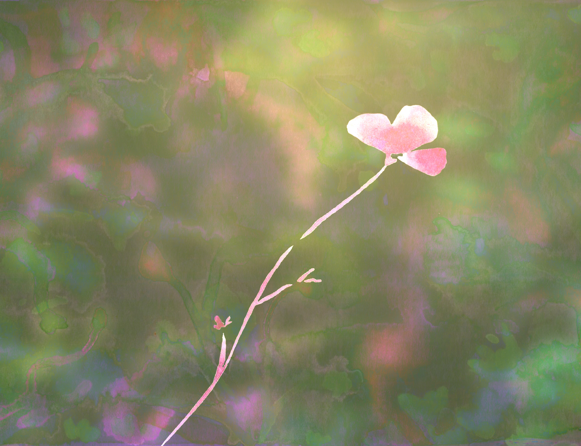
Once I collected my reference material I experimented with combining my paintings and textures digitally. This resulted in a collection of these beautifully moody background textures with floral silhouettes hidden throughout the piece.
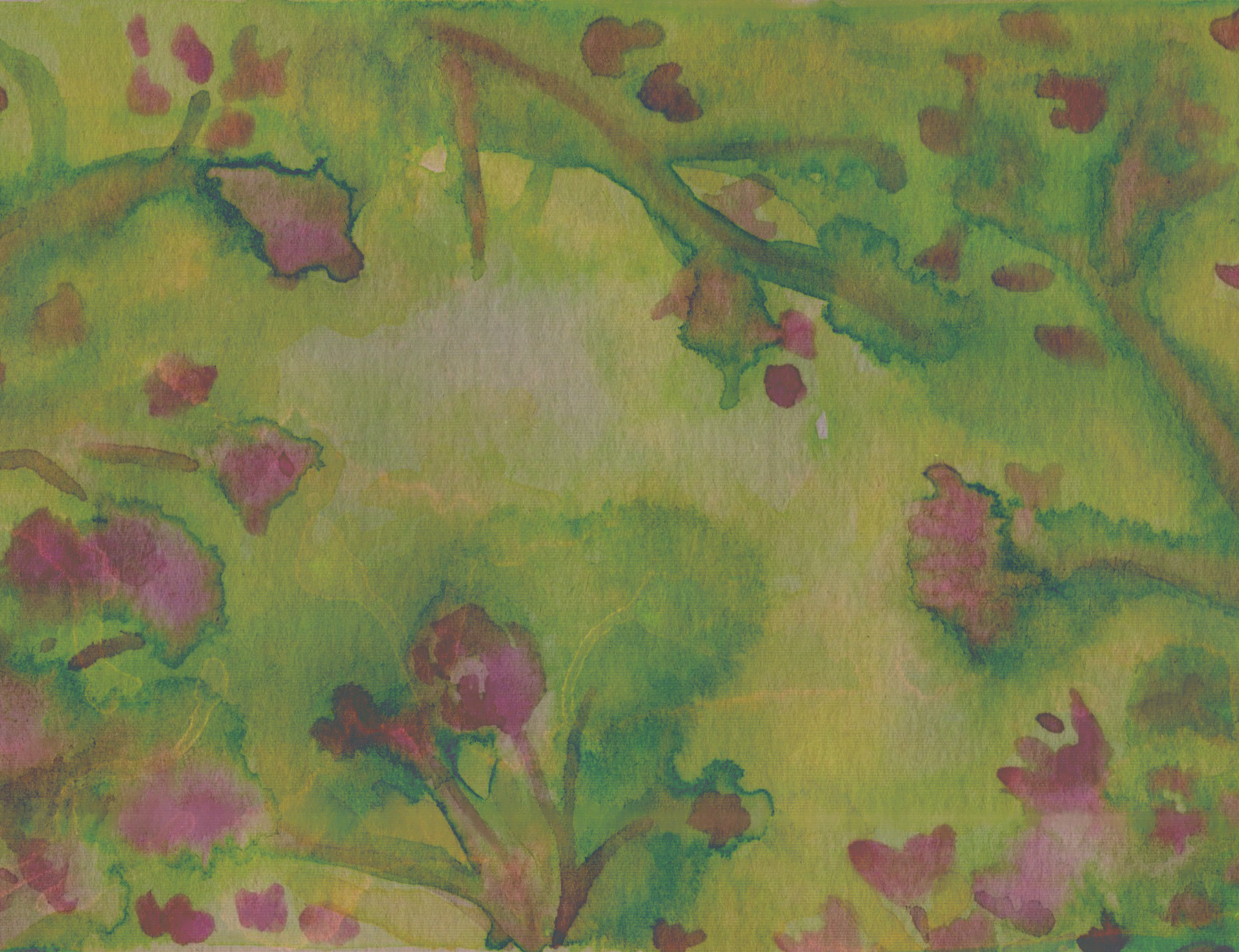
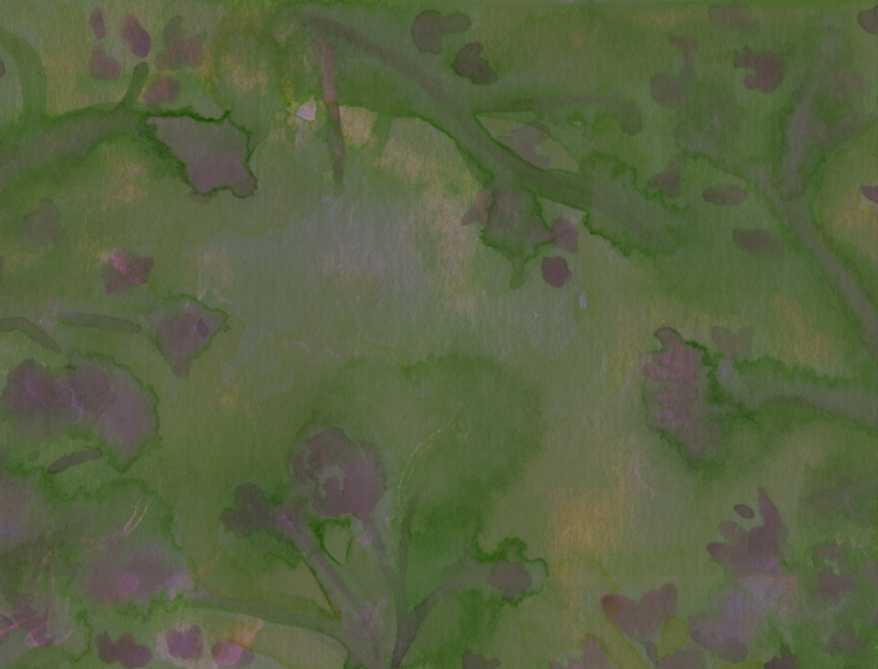
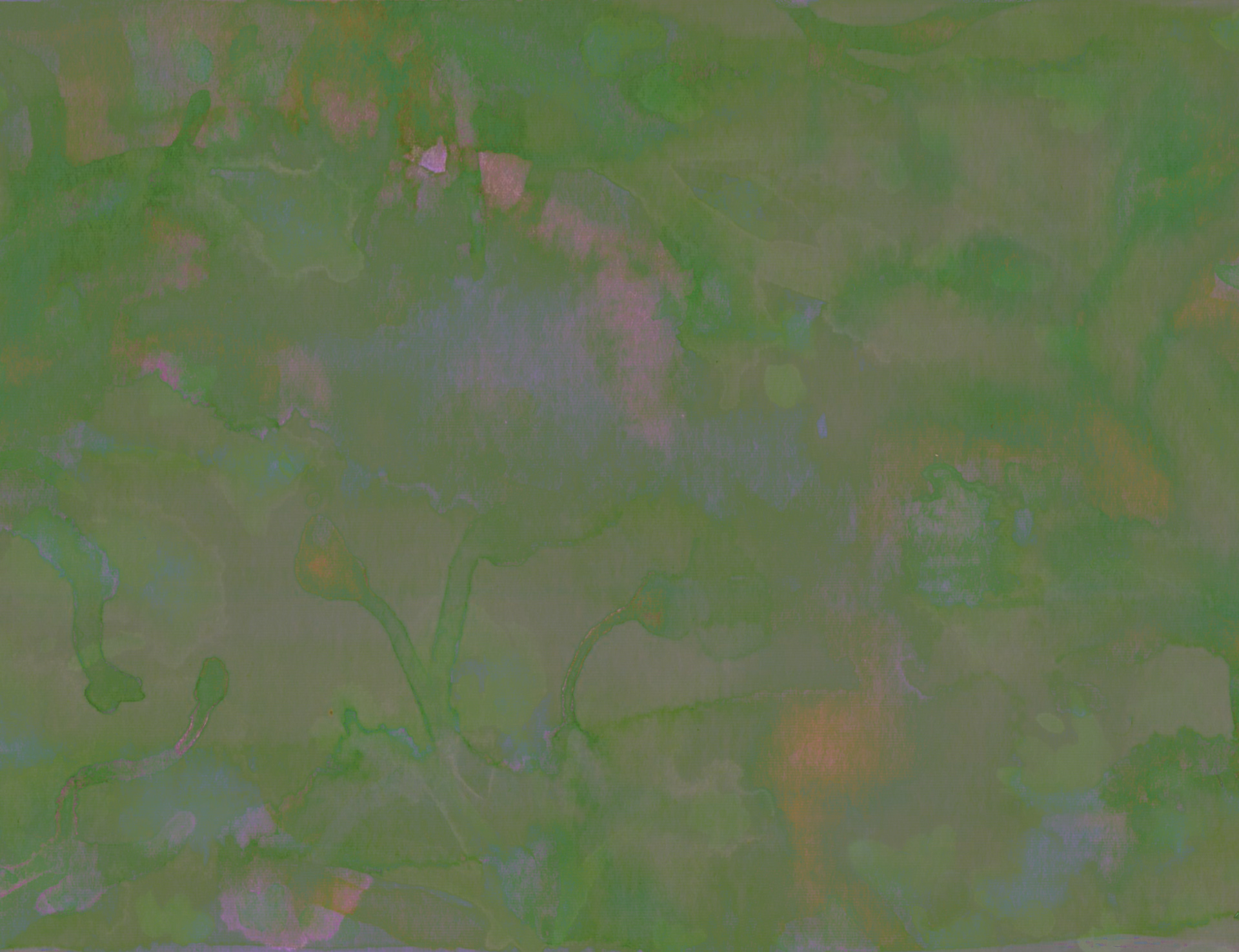
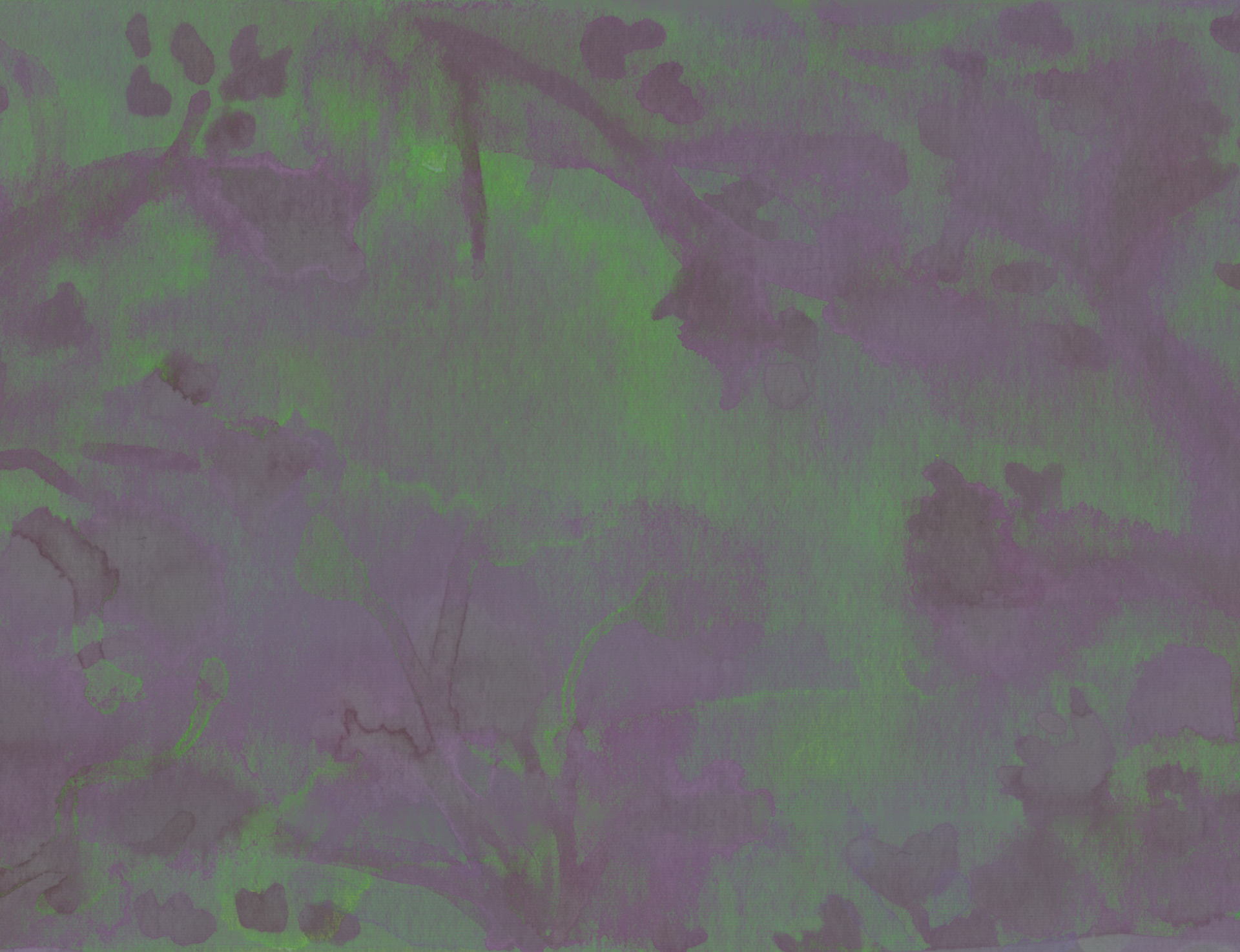
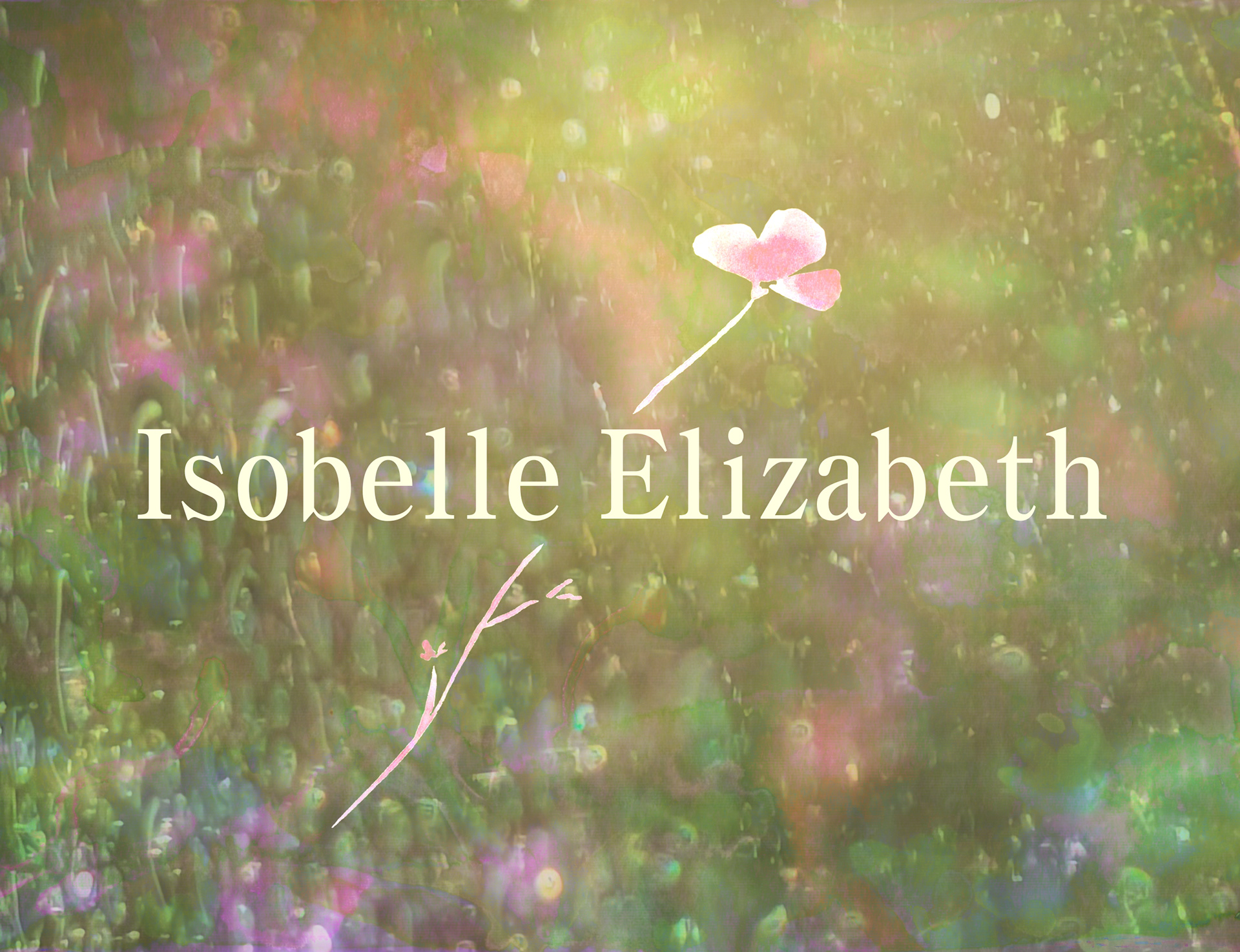
After choosing the textures and colours that would shape the mood of the piece, I softened one of the layers with a gentle blur, letting it dissolve into a mist-like backdrop for the text or logo to rest upon. Wanting to weave together the organic textures from my reference photos with the fluidity of my watercolour paintings, I layered in a veil of raindrops. This subtle overlay deepened the atmosphere, allowing the softer hues beneath to glow through. In the end, the illustration took on the feeling of peering through a rain-kissed window into a quiet, enchanted garden.
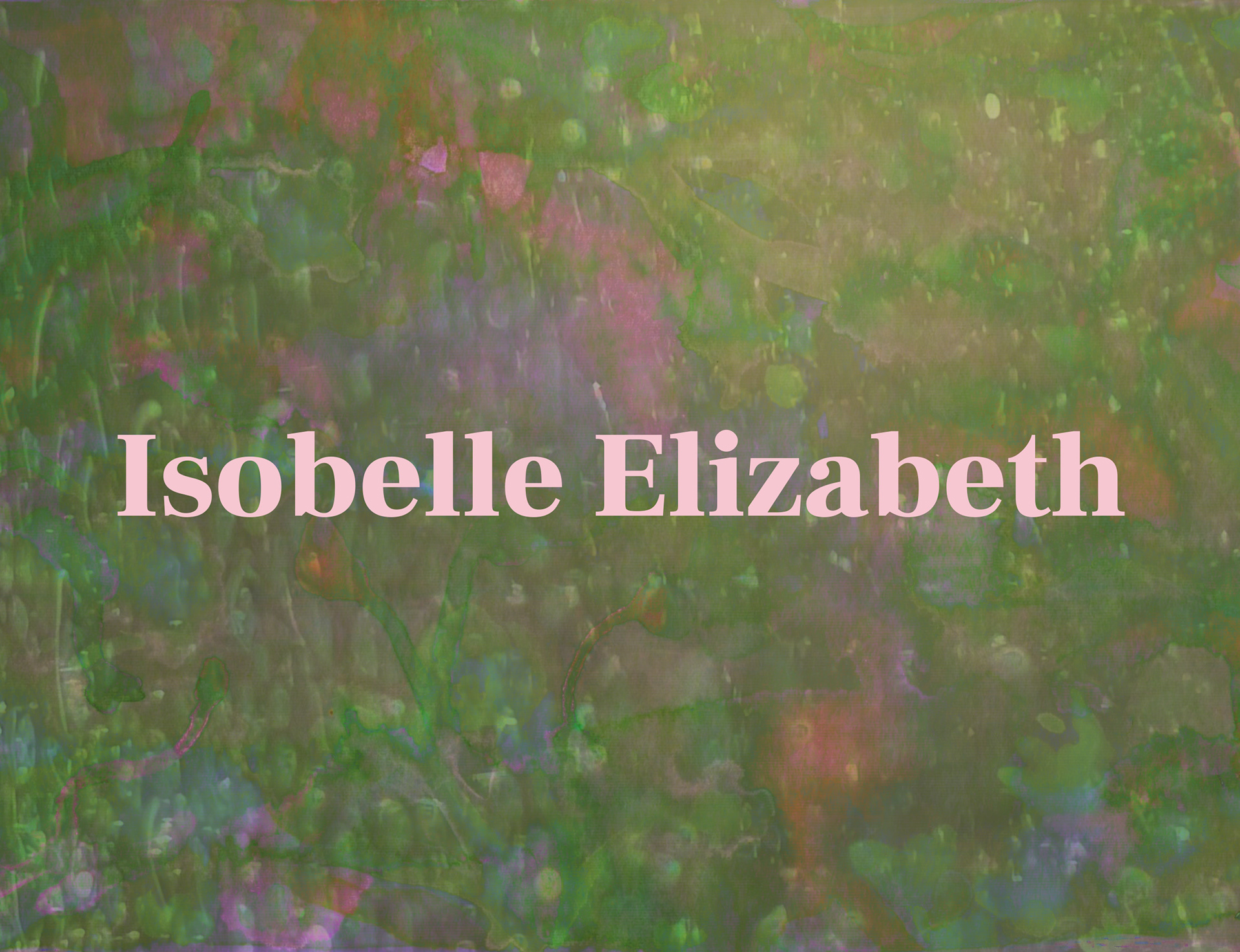
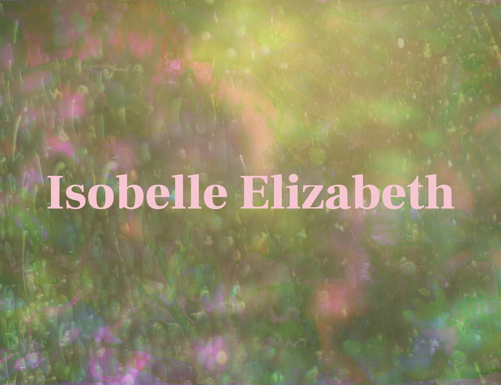
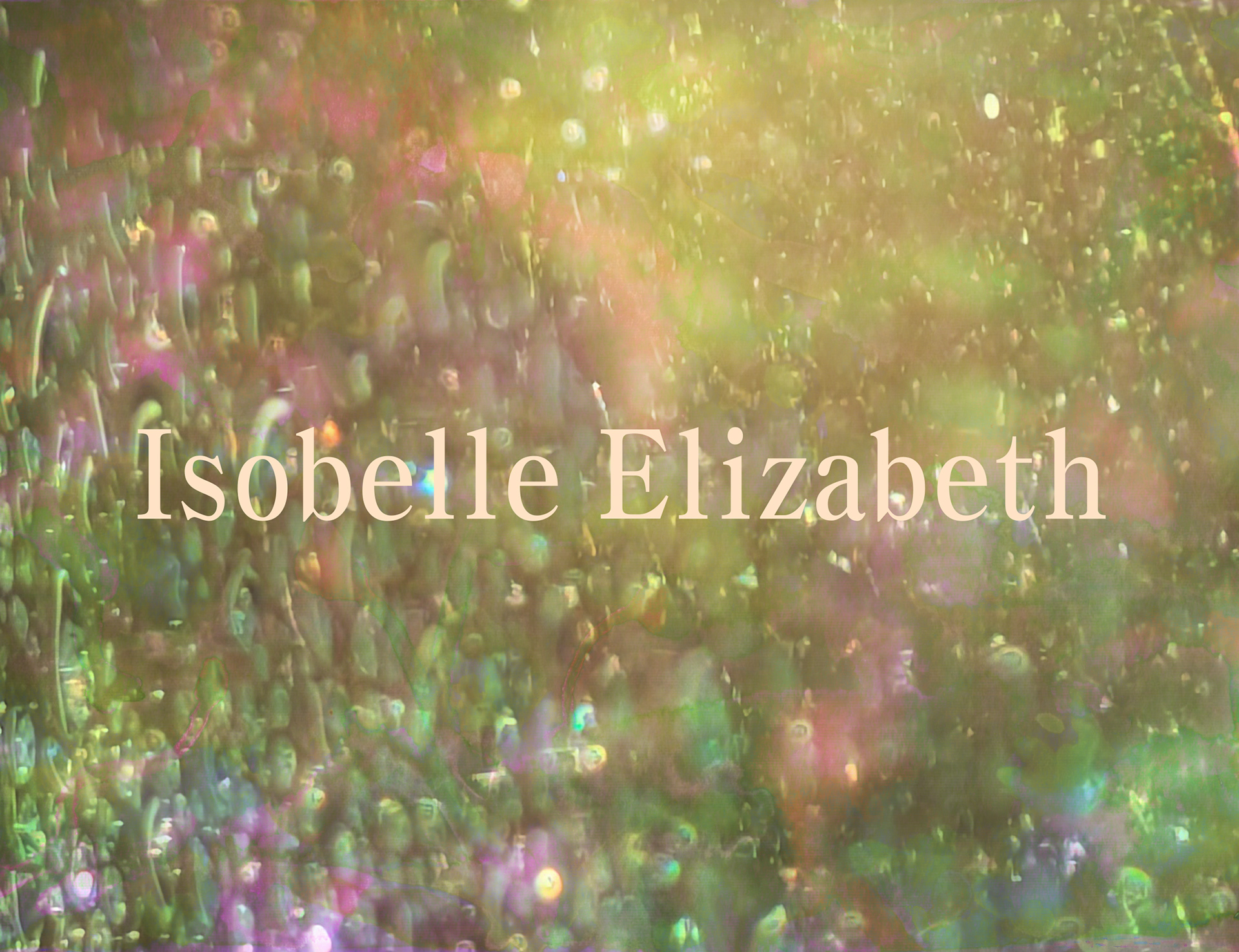
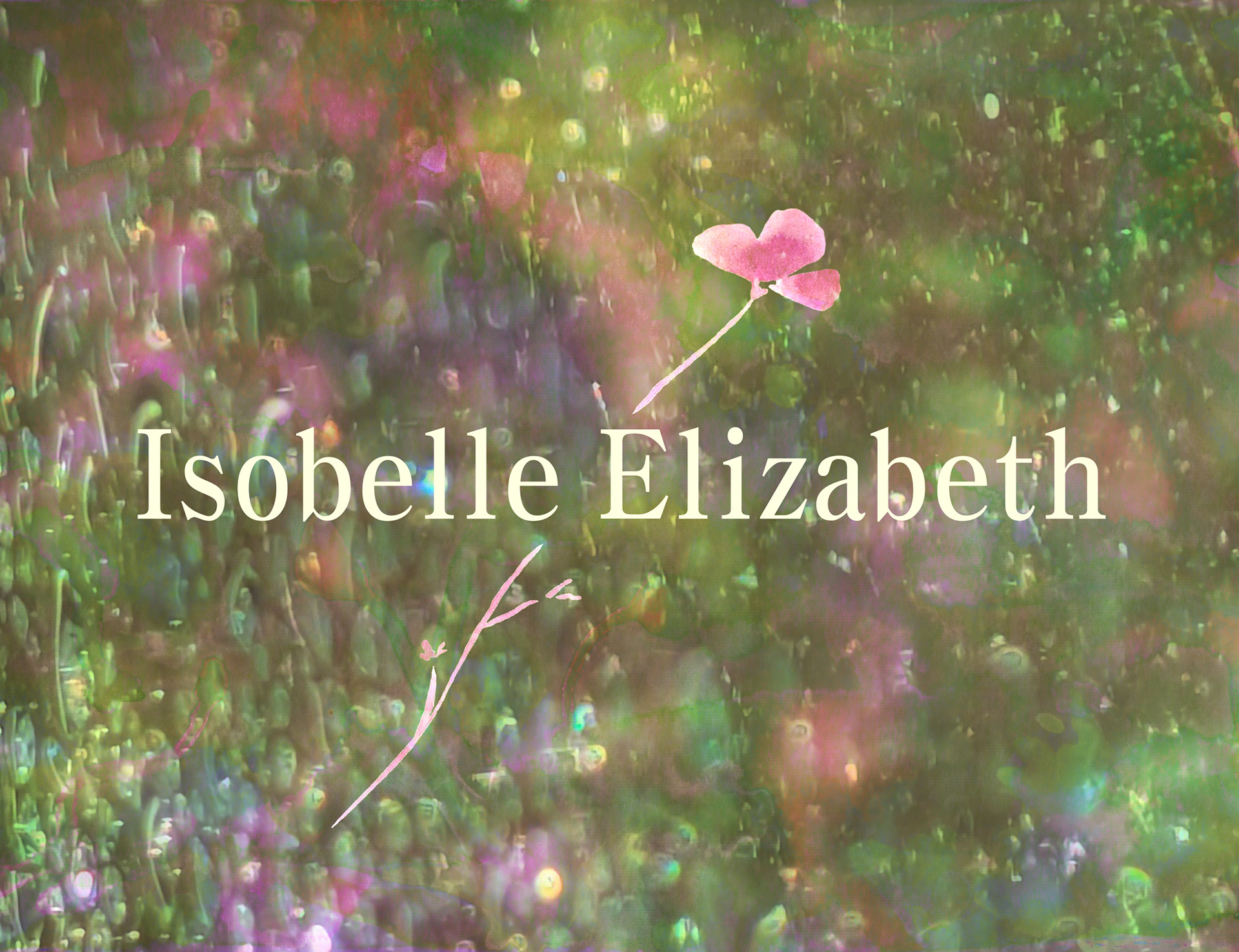
Throughout this project, I found myself drawn to exploring typography as a central element. I wanted the text to feel sharp and deliberate, something that could stand confidently against the soft, intricate background. This is why I chose a clean digital typeface rather than a more organic one.
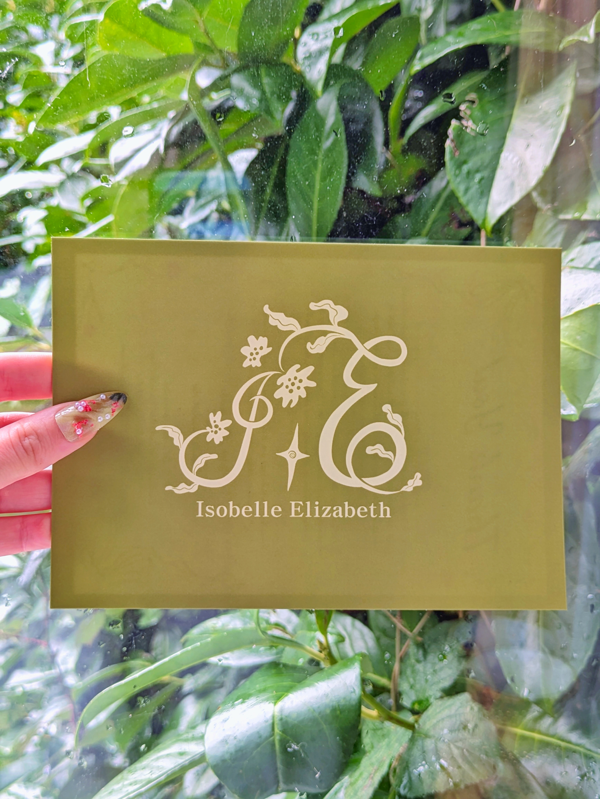
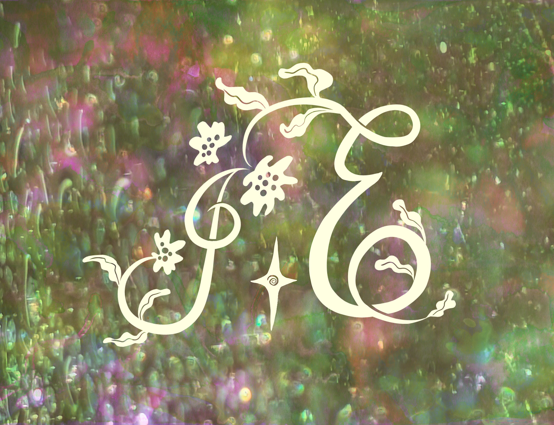
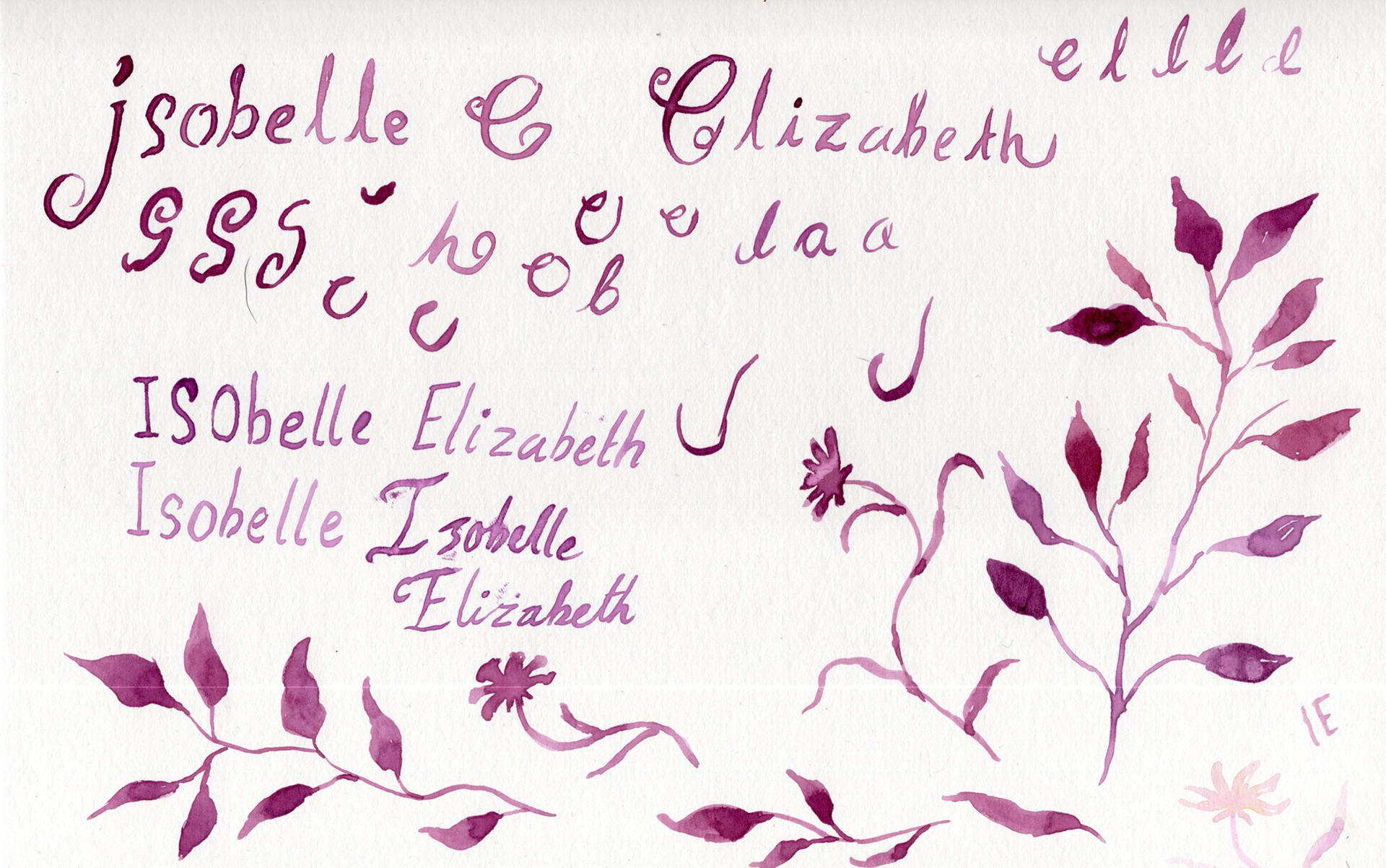
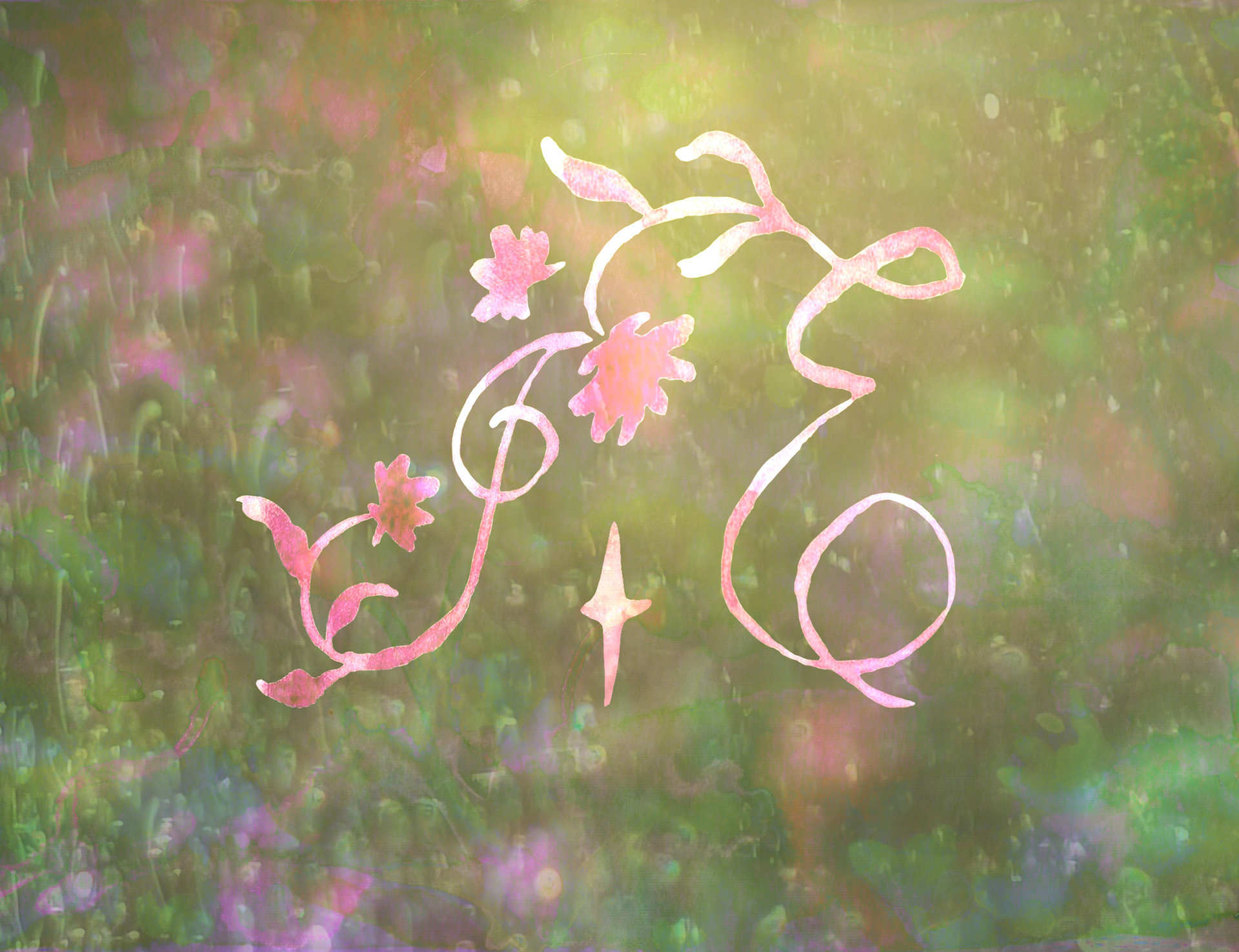
For the logo, I painted the initials I and E in several different styles before settling on a floral-inspired calligraphic design. Paired with a small whimsical star, it felt true to the artistic direction I imagine for myself of delicate, expressive, and rooted in nature.
In the end, my process led me to create the logo in a digital format. At first, I truly hoped to return to traditional media, believing that the larger scale of the logo would allow the textured watercolour marks to remain legible and expressive. I imagined a symbol that carried the softness of paint, the gentle irregularities of brushwork, and the organic feeling that comes from working by hand.
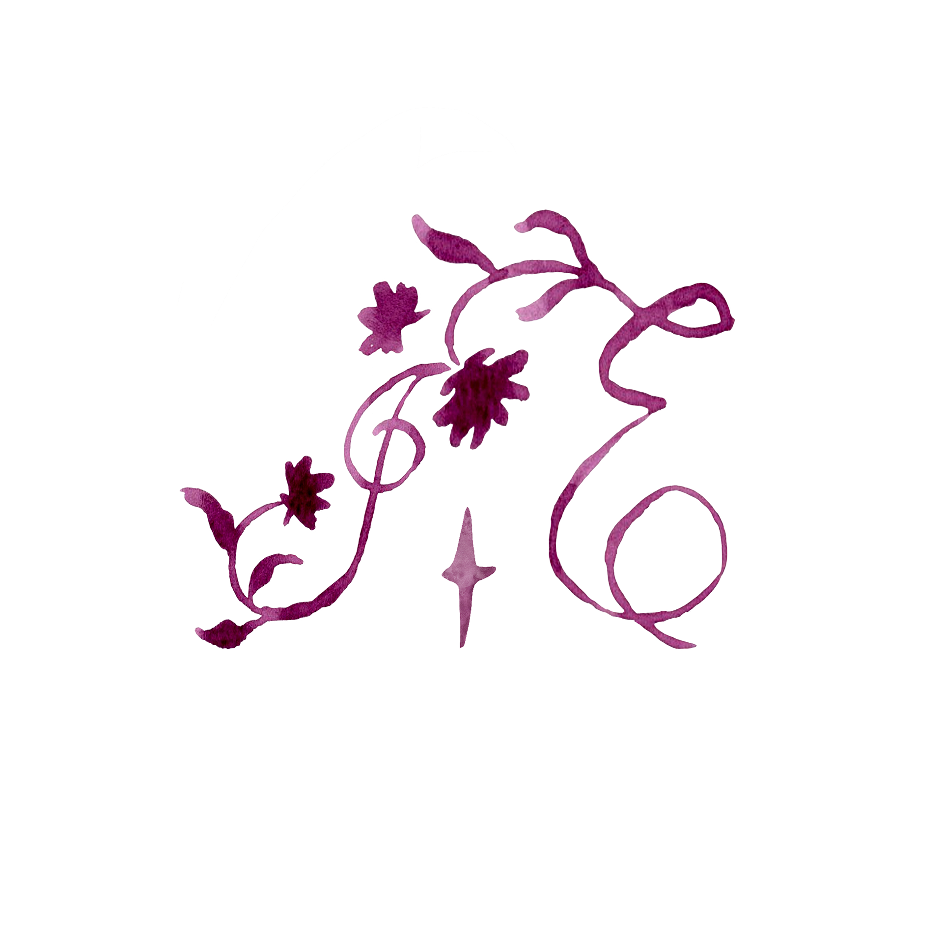
However, as I experimented, I realised that the textures, while beautiful, sometimes competed with the clarity I needed. The essence of the design was present, but the fine details wavered when reduced or placed against busier backgrounds. I began to explore a digital interpretation, carefully tracing the shapes and movements of the original painted forms. Slowly, the design evolved into a clean vector that still held the spirit of the hand-painted version. The curves became more refined, the structure more confident, and the overall impression far clearer.
What surprised me was how well this digital form carried the intention of the original artwork. It felt as though the hand-drawn character had been distilled into something purer, something that could move gracefully between contexts without losing its identity. This new version became far more versatile, able to shift seamlessly from screens to printed surfaces while maintaining the same quiet elegance.
Choosing digital creation in the end allowed the logo to live in many different spaces with ease, while still honouring the seeds of inspiration planted in the traditional sketches and painted textures that began the journey.


Overall, this project became a blend of traditional and digital practices, a reflection of how I usually work but with enough room to play, explore, and refine. I wanted to build on the skills and visual language I already hold while creating something fresh, something that hints at the direction I want my art to grow.